


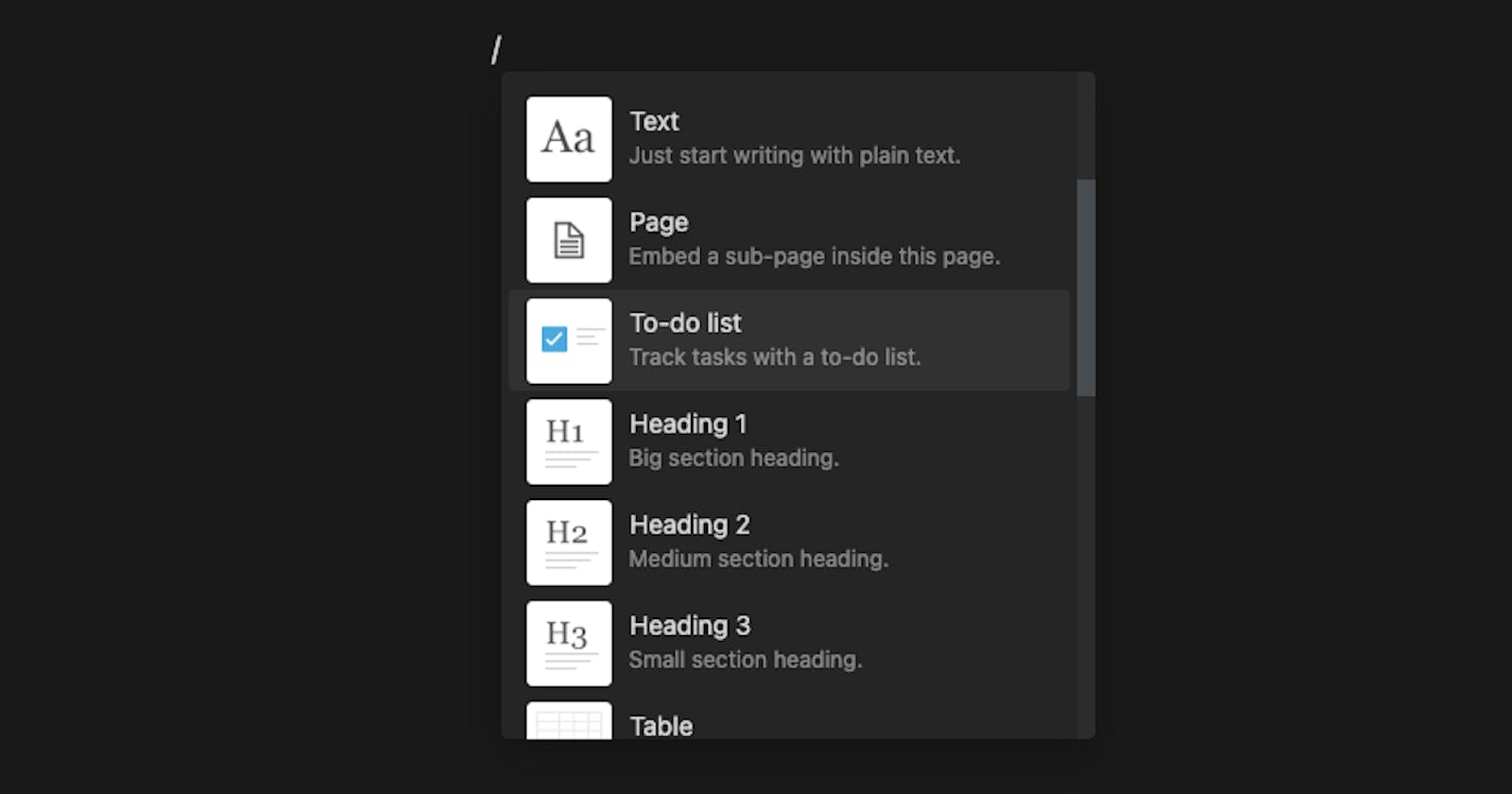
Notion is a great productivity application and one of the factors that differentiate it from other similar apps in this category is its easy-to-use commands feature. This is invoked when we press the “/” key. In this article, we are going to learn how to create this interaction for our note editor. We will use the slate.js library for this. This is an attempt to explain the functionality in the easiest way possible. Now let’s get started…
What is Slate?
Slate is a completely customizable framework for building rich text editors. It can do this because all of its logic is implemented with a series of plugins, so you aren't ever constrained by what is or isn't in the "core". You can think of it as a pluggable implementation of contenteditable built on top of React - (Taken from slate.js documentation). You can learn more about it here. https://docs.slatejs.org/.
Overall I have divided this article into the following sections:
Getting started with slate.js
Understanding the required Concepts
Implementation
Getting started.
Let's initialize our web app with create-react-app, and name it notion-clone.
npx install create-react-app notion-clone
Install the required packages.
yarn add slate slate-react
Create a TextEditor component, import all the required components, and that’s it, now you have a basic working project. click here to check how it will look.
import React, { useState } from "react";
import { createEditor } from "slate";
import { Slate, Editable } from "slate-react";

const initialValue = [
  {
    type: 'paragraph',
    children: [{ text: 'A line of text in a paragraph.' }],
  },
]

const App = () => {
  // createEditor function will return an Editor object, and withReact function will add react specific behaviour to the editor.
  // We will store it inside a state variable called editor
  const [editor] = useState(() => withReact(createEditor()))
  return (
      /* Slate component provides the editor context to it's children.
      Editable component renders the text editor where we can write
      and edit stuff */
    <Slate editor={editor} value={initialValue}>
      <Editable />
    </Slate>
  )
}
Understanding the required concepts
Slate.js is a highly customizable rich text editor. Whatever we type inside our note component (let’s call this note data also called descendants) will be stored as an array of objects and is rendered on the screen in the form of HTML elements. We will discuss its structure and how to customize it in the later parts.
Nodes:
Nodes are of 3 types:
The root-level Editor node:
This is the top-most level of the node, all the note data can be accessed inside the children property of this node. It contains a bunch of useful methods and properties, we will discuss this in a later section. The Editor node consists of multiple Element nodes.
  interface Editor {
      children : Node[]
      selection : Range | null
      // ...more properties and helper functions
  }
The element level Element node:
Elements are present in the middle layer of the document and we can customize it as per our needs. Element node consists of multiple text nodes.
  interface Element {
      children : Node[]
      type : 'heading-one'
      // ...we can add more custom properties here, similar to type
  }
The Text level Text Node:
Text nodes are the lowest-level nodes in the tree, containing the text content of the document, along with any formatting.
  interface Text {
    text : string
    bold : true
    // ...we can add more custom properties here, similar to bold
  }
These Nodes combine together to form an editor document.
Locations:
Locations are used to refer to a specific node or a point in the document while performing various operations like selection, insertion, updation, deletion, etc.
There are 3 ways to refer to a location.
Path: This is just an array of numbers used to point at a specific element node.
type Path = number[]Point: This is a combination of path and offset that can be used to locate any point in a node. It can be used to specify the exact location of the cursor inside the editor.
  interface Point {
    path: Path
    offset: number
  }
Range: This can be used to specify a range of a selection between two point locations.
  interface Range {
    anchor: Point
    focus: Point
  }
Rendering:
Internally note data is stored as an array of objects also called nodes. We can define a custom render function to render these objects in the required way. We need to pass this to the Editable component.
 const renderElement = ({attributes,children,type}) => {
    switch (type) {
      case 'heading-one':
        return <h1 {...attribututes}>{children}</h1>
      default:
        return <p {...attributes}>{children}</p>
    }

// This is passed to the Editable component
<Editable renderElement={renderElement} />
Transforms:
Transforms are set of operations like update, delete, insert, move, etc. that you can apply to single or multiple sets of nodes.
Slate has an immutable data structure, which means you cannot directly change its data. Instead, we use transform operations to change its data.
// Examples

Transforms.select(editor, {
  anchor: { path: [0, 0], offset: 0 },
  focus: { path: [1, 0], offset: 2 },
}) // this will select the text in given range

Transforms.delete(editor, {
  at: {
    anchor: { path: [0, 0], offset: 0 },
    focus: { path: [1, 0], offset: 2 },
  },
}) // this will delete text in given range
Implementation
Now that we have a basic understanding of the required concepts, we can start with the implementation of our functionality. Let's look at the steps involved...
Declare a list of commands.
This is the list of commands we want to invoke after pressing the "/" key.
 const commandOptions = [
   "heading-one",
   "heading-two",
   "code-block",
   // ...other commands if required
 ];
Declare custom elements that need to be rendered once a command is invoked.
In this step, we declare how each command option will be rendered on the page, eg. heading-one, code-block, etc.
 const HeadingOneBlock = ({ attributes, children }) => {
   return <h1 {...attributes}>{children}</h1>;
 };

 const HeadingTwoBlock = ({attributes,children}) => {
    return <h2 {...attributes}>{children}</h2>;
 }

 // similarly we can declare complex functionality eg, a component to render a code block or images, etc.
Create a function to render custom elements.
Here we are writing a function that will render the custom elements depending on the node type.
 const renderElement = ({attributes,children,type}) => {
     switch (type) {
       case 'heading-one':
         return <HeadingOneBlock attributes={attribututes}>{children}</HeadingOneBlock>
       // ...more components
       default:
         return <p {...attributes}>{children}</p>
  }
Create a portal.
React Portal provides a way to render a component to dom nodes present outside react component tree. In our case, we want to show a list of commands when we press "/", and these options should float exactly where our cursor is present. The reason we will be using this is that It should not be affected by any CSS styles written for its parent component.
Here "RenderCommandList" component takes the command list and renders it on the screen. We will also create a "ref" and pass it to "RenderCommandList". We will discuss its use in later parts.
// Whatever we pass as children will be attached to document body export const Portal = ({ children }) => { return typeof document === "object" ? ReactDOM.createPortal(children, document.body) : null; }; const App = () => { // ...some code // We will pass this refrence to RenderCommandList so that we can handle its position later according to cursor placement. const ref = useRef(); // We will show/hide command options when we press "/" key. const [showCommandMenu, setShowcommandMenu] = useState(false); return ( <div> <Slate editor={editor} value={initialValue}> <Editable renderElement={renderElement}/> {showCommandMenu && ( <Portal> <RenderCommandList refrence={ref} /> </Portal> )} </Slate> </div> ); };Add a key-down event handler.
In this step, we will declare a function "onKeyDownHandler" and will pass it to the Editable component. Whenever any key is pressed this function will be called and we can execute the required functionality. In the below code block once this function is invoked
we are checking if the "/" key is pressed. If true, the "showCommand" state is set to true, and the "commandMode" state is set to true as well.
If "ArrowUp" or "ArrowDown" is pressed we update the selected "commandIndex".
On pressing enter, the "executeCommand" function is called and the required functionality is executed. We will discuss this function in the later part.
const [commandIndex, setCommandIndex] = useState(0);
const [commandMode, setCommandMode] = useState(false);
const onKeyDownHandler = (event) => {
if (event.key === "/") {
setShowcommandMenu(true);
setCommandMode(true);
} else if (commandMode && event.key === "ArrowDown") {
event.preventDefault();
setCommandIndex(commandIndex + 1);
} else if (commandMode && event.key === "ArrowUp") {
event.preventDefault();
setCommandIndex(commandIndex - 1);
} else if (commandMode && event.key === "Enter") {
event.preventDefault();
setShowcommandMenu(false);
setCommandMode(false);
executeCommand(event);
}
};
// Pass it to Editable component
<Editable renderElement={renderElement} onKeyDown=
{onKeyDownHandler}/>
Add editor change handler.
Now we will create an "editorChangeHandler" function and pass it to the Slate component. This will be called when editor data changes. Inside this function when the "commandMode" is active, we update our "target" state. In this state, we store the location of our current selection or cursor location in terms of Slate Range. "target" state will be used for determining at what location to render our command options later.
 const editorChangeHandler = (value) => {
       const { selection, children } = editor;
       if (commandMode) {
         const currentNode = Node.get(editor, selection.anchor.path);
         setTarget(selection);
       }
     };

 // Pass it to Slate component
 <Slate editor={editor} value={initialValue} onChange=
     {editorChangeHandler}>
Add execute command function.
Remember we called the "executeCommand" function in the 5th step? Here we just check the "commandIndex" and get the selected command. Then we apply the correct transforms to update the note data as required.
Slate has an immutable data structure, which means you cannot directly change its data. Instead, we use transform operations to do this.
As per the code written below, if the current selected command is "heading-one", we do two things
Apply deleteBackward transform to remove "/".
Update the currentNode by changing its type to "heading-one". Inside the "children" property, we can specify text inside the "heading-one". In the "at" property we specify the location at which the current transform needs to be applied
    const executeCommand = (event) => {
      switch (commandOptions[commandIndex]) {
          case "heading-one": {
              Editor.deleteBackward(editor, { unit: "character" });
              Transforms.setNodes(editor, {
                type: "heading-one",
                children: [{ text: "" }],
                at: editor.selection,
              });
              break;
            }
          // ...more functionality
          default: {
              event.preventDefault();
            }
          }
        };
Add useEffect for calculating the portal position.
Here, if the editor data is selected command or cursor position changes we execute the following code. It performs the following actions...
First, we check if we have the current selection location in the "target" state.
Remember the reference passed to the "RenderCommandList" component mentioned in the above code? we get that and store it in a const named "popUpRef".
"ReactEditor.toDOMRange" gives us the native dom Range from the Slate dom range.
The domRange.getBoundingClientRect() method returns an
DOMRectobject providing information about the size of an element and its position relative to the viewport.Finally set the position for the "RenderCommandList" using this data.
 useEffect(() => {
     if (target) {
       const popUpRef = ref.current;
       const domRange = ReactEditor.toDOMRange(editor, target);
       const rect = domRange.getBoundingClientRect();
       popUpRef.style.top = `${rect.top + 24}px`;
       popUpRef.style.left = `${rect.left}px`;
     }
   }, [ editor, commandIndex, target]);
And that's it we have our command functionality working.
That's it! Our implementation is complete...
Here is a full working demo of what we have implemented- Link
Here is the Github link for its code - Link
To learn more about slate.js, check out the official docs - Link
I hope you find this blog useful, let me know if you have any questions or suggestions. Feel free to DM me on Twitter - Link.
Have a great day!